Repetitive or Stylish?
- Sophia Canfield

- Sep 23, 2020
- 3 min read
Updated: Sep 28, 2020
I loved reading about the background of layout, it gave me a lot of psychological background for why we like to look at one thing more than the other. In branding this is huge.
When the presenter mentioned how you wouldn't want to make a jewelry company's color Tiffany blue to stand out, I couldn't help but remember this example. I was absentmindedly mocking up a logo for a friend's art company and just doing some market research to see what was out there, I saw the exact same template used THREE times on Etsy. Then I remembered I had seen it in Canva, which is why every was using the exact same. It was shocking to me they didn't even try to change the color, font, angle, or anything!
When Sean discusses the record labels with variety, "There is a difference between using repeating forms to enhance communication and simply duplicating to maintain the uniform appearance. While functionality and legibility are critical, today's audience expects to be entertained and excited by design. A bold use of repetition can be a useful tool to achieve this." I felt this really resonated with branding today.
Now I was curious about a few things, especially in choices in branding - especially logos and a uniform style. I really wanted to discuss K-Cups, because their shape is very reminiscent of a record! You are kind of locking in to a particular format, but what can brands do to stand out?

It seems as though most choose to simply change the background color and keep everything else uniform and reliable, but clearly with these colors chosen, I'm a little confused on what the flavor is going to be. It also is a bit of a boring look as well as in-synchronous with what you'll be drinking.
When I was a Starbucks barista, we often had folk completely miss their favorite brand on the shelves because every boxed look TOO similar. This was all due to the colors this time. They changed the patterns and art on the boxes, even the font, but they all still look exactly alike from afar:

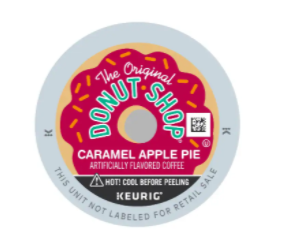
Another example, these are ALL different flavors... What??
Nice branding with the logo, but no help with discerning flavors and generally a bland look:

Here is a brand I think kills it with the consistency, recognizability and style:


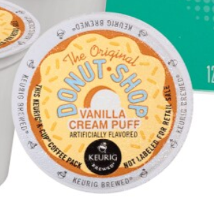


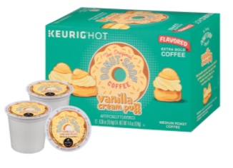


The graphics on the box align with exactly what is on the K-Cup, each are unique to their flavor, but the brand is still completely recognizable.
And... now I want coffee.
Speaking of repetition, here is my collage for this week as well! I really wanted to go for a scrapbooking effect, so added the paper stroke on some of the images. I also tried to push the theme of each action with effect - shadow when they're looking at their shadows on the ground, outer glow for absorbing the knowledge through the laptop, and crumpled texture for the "scary" picture. I made all except the center photo a bit hazy by using a color overlay on low opacity for a foggy, gentle, pastel effect.
(PSD uploaded to Dropbox)

My second collage is from a photo I captured the other day for a photoshoot, then I went around my neighborhood and took photos of all the interesting numbers I could find! I really love the differing aesthetics all pieced together. I masked each number off from the original photo and bumped up the saturation. For the model, I "select object"-ed her and copied her on top and slid her over to create a mini glitch effect. Her layers I changed the hue and did a soft grey color overlay to create the dreamy effect. The top layer of her I did a color burn layer pulling out the orange.
See if you can identify some of the numbers!


Comments